inkFrog offers you hundreds of designer templates, to make your listings more user-friendly and encourage shoppers to buy. But as you customize them, are you inserting everything you can to make the sale?
Here are five details that are often forgotten—but that can encourage shoppers to buy.
1. A bullet list.
People don't like to read, and they especially don't like to read sentences and paragraphs. But they do like to be sold on a product before the buy it. How do you get around this paradox and communicate about your product without using sentences?
Use bullets. Whatever you're selling, find at least five positives or basic specifications about your product and include them in your item description as a bullet list. Position it so that it's easy to find and keep each bullet short enough to be easy to read.
These bullets can mean the difference between moving on and taking action when a shopper is looking at your listing.

Smart shoppers love bullet lists that conscientiously inform them about their purchase.
2. The reason you stock and sell this product.
The "why I'm selling this" line is often assumed to belong to used items only ("I'm selling this camera because I upgraded to a newer one") but the fact is that there is a reason why you're selling this product and it's nearly always persuasive to shoppers.
Consider the following lines:
"The latest addition to our catalogue. We think you'll love it."
"One of our best-selling products over the last year."
"One of our highest-reviewed products."
"Our product line wouldn't be complete without it."
All of the above are honest sellers' reasons for including a product in inventory. They're also endorsements that will encourage shoppers to buy and reassure them that shoppers of all kinds are likely to have a positive experience.
3. A variations image.
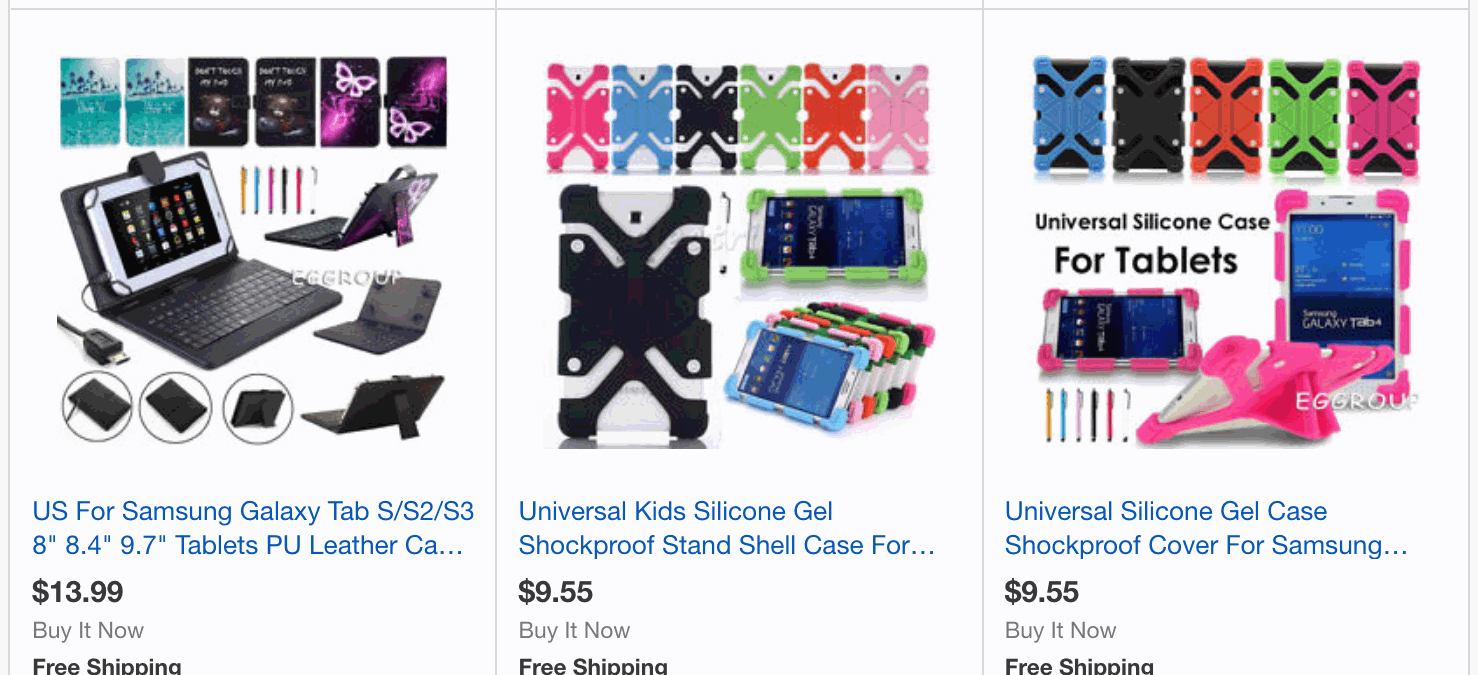
If you're selling variations of a product—with multiple colors, multiple versions, or other significant differences between each selection—be sure to include a photo that shows each variation in one place, if you can.
Nothing kills variation sales as quickly as a shopper's inability to visually evaluate the actual variations of your product that they're interested in buying—yet without a variations image, shoppers may make their decision based solely on one variation, not knowing that they can scroll through many additional images in your listing gallery.
Showing all variations together in one prominently featured image clues shoppers in to the fact that your product is available in their favorite color or configuration, encouraging them to make a selection for the one that they want.

Lead with an image that shows every product variation, or that shows a product from every angle.
4. Your commitment to customer satisfaction.
Think it's assumed that a seller will stand behind their products? Think again. Many don't, and shoppers are swayed by sellers who take the time to acknowledge this.
The language doesn't have to be complicated. Consider the following:
"We are committed to satisfying our shoppers. If you have problems, contact us right away. We'll make it right."
You haven't promised anything earth-shattering or committed to a specific course of action, so your options in each case are still open. But you have told your shoppers that you care about them, and that counts.
This will also help to ensure that shoppers contact you with problems, rather than simply leaving negative feedback.
5. The name of your store or business.
Be honest—have you forgotten about this in your listings?
No, it's not required to make a sale on eBay. But featuring your business name prominently in your template encourages shoppers to remember you and your store from now on—and tells them that you're serious and professional about your business.
If your logo includes your business name, then make sure that your templates feature your logo. If your logo doesn't include your business name, either tweak it to ensure that it does or add both your logo and your business name in nearby text to your template.
Don't make this so large that it's overwhelming—shoppers eyes are naturally drawn to logos and business names without needing to be "yelled" at by an oversized representation. Just make sure that it looks good and is positioned somewhere near the top of your template.

Pretty template. But who's the "Us" in "About Us" or the "Our" in "Our Categories" here? Tell them!
Think Like a Shopper
As you build your listings and templates, think like a shopper—what would you like to see if this was your purchase? What kinds of details nudge you toward making a purchase?
When in doubt, join your customer base and do what they're doing—go shopping for the kinds of products that you sell. Note which listings will encourage you to remember who's selling a product and to feel comfortable making a purchase.
Then—learn from them and recreate their strategies.
Join the Newsletter
Get started for free today!
Try it free
Join the 200,000+
using inkFrog!


